Just like kids waiting for the arrival of Santa Claus, we get pretty excited at Good Earth Plant Company this time of year, but for something different. We love the announcement of the Pantone Color of the Year!
For 20 years in early December, the Pantone Company announces its annual choice for “Color of the Year.” We think about color a lot in our biophilic design work. While green dominates our designs, there’s a lot of creative potential in the choice of containers and other physical elements. So we can’t wait to see what might be hot. This year, it’s something cool.
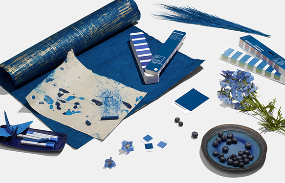
Unlike the last few years, Pantone selected a soothing, timeless color for 2020. It is called “Classic Blue.” It’s not quite navy blue, and not quite royal blue. Pantone executive director Leslie Eiseman says, “We are living in a time that requires trust and faith. It is this kind of confidence that is expressed by Pantone 19-4052 Classic Blue, a solid and dependable blue hue we can always rely on.”

Classic Blue is the 2020 Pantone Color of the Year.
“Classic Blue provides an anchoring foundation. A boundless blue evocative of the vast and infinite evening sky, Classic Blue encourages us to look beyond the obvious to expand our thinking; challenging us to think more deeply, increase our perspective and open the flow of communication.”
No, blue was NOT chosen to be any sort of political statement, even though blue is associated with the Democratic Party. Pantone has chosen a shade of blue several times, including its very first pick in 2000 – Cerulean Blue. It was followed by Aqua Sky (2003), Blue Turquoise (2005), Blue Iris (2008), and Serenity (2016).
Last year’s choice, “Living Color,” a wild bright coral pink, didn’t have a lot of fans.
Is there a single person who doesn’t like the color blue? We don’t think so.
Who doesn’t love blue? Blue is my mom’s favorite color. Isn’t it the favorite color of everyone’s mom? It seems to be true! Blue is also associated with boys.
Blue is on half of all the world’s national flags, including the American flag. Only red (75 percent) and white (70 percent) are more popular (and we’ve got those, too).
A blue moon is an additional full moon appearing as either the third of four full moons in a season, or a second full moon in a month of the common calendar. It isn’t because it actually looks blue. We get a blue moon in 2020 during its Pantone year – it’s on Halloween, October 31, 2020.
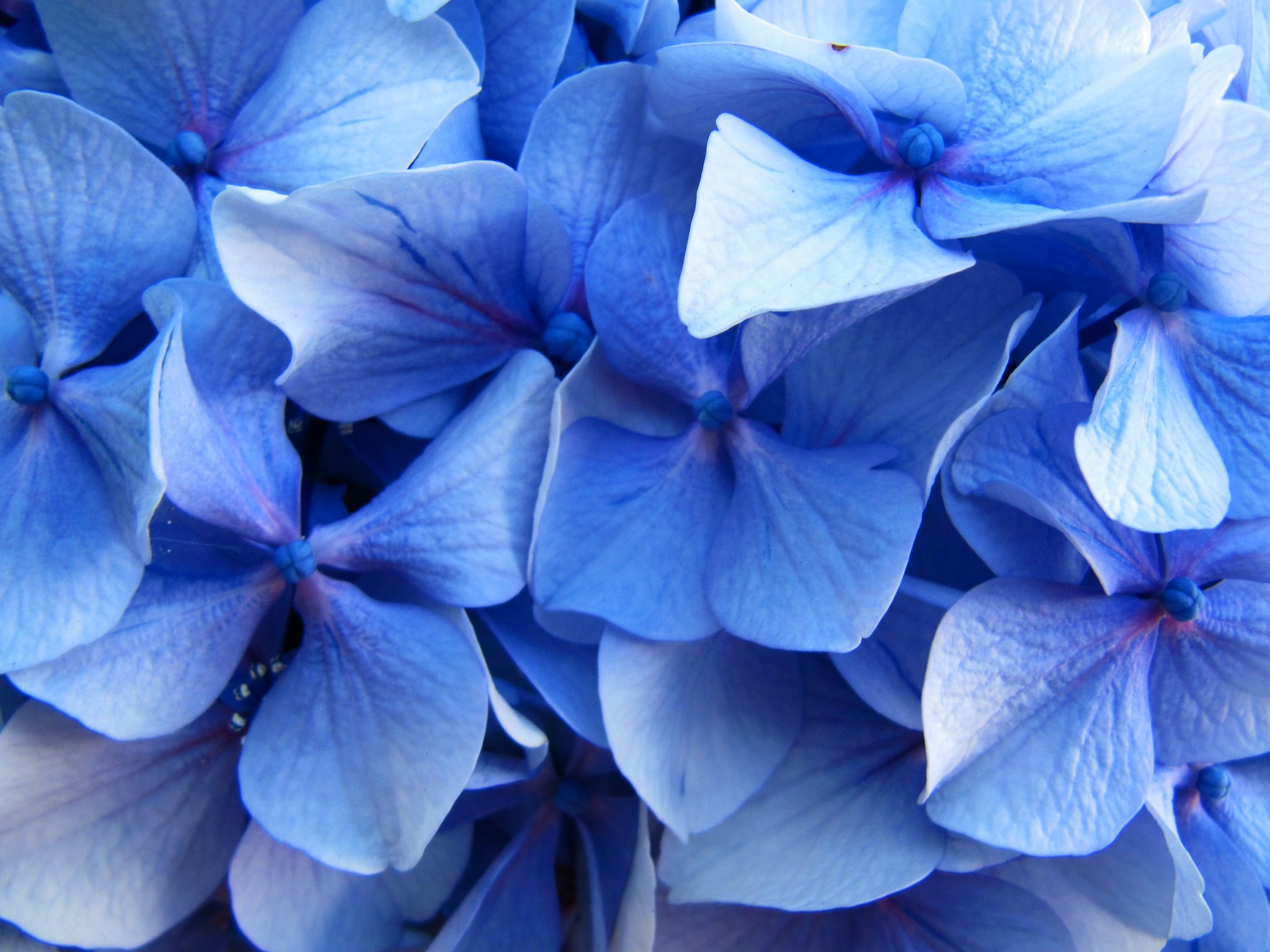
Closeup of a beautiful hydrangea. Do you see blue or lavender, or something in between? Photo: LL Marei, Flickr – Creative Commons License
People can get the blues, and play the blues. In the 17th century, there was an expression in England referring to “the blue devils.” It described hallucinations seen during extreme alcohol withdrawal. Boy, that’s one harsh hangover. It came to mean a more simple definition of mental agony or depression.
Blue as a color in nature? The truth is, there is no such thing as a blue flower in nature. We’ve written in this blog about the quest to create blue flowers. Some have gotten pretty close – but the quest continues.
You won’t be seeing any Classic Blue plants in our Plantscaping, living walls, or green roofs. But when we work with preserved moss in our moss walls, the closest we come to Classic Blue is with either “Ice Blue” or “Blue Lavender.” Go for it, challenge us!
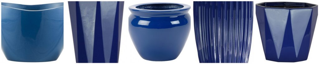
We love blue containers and we have many good choices for our clients.
Where we can really go crazy with color is our Plantscaping containers. In recent years, there’s so much creativity in the decorative containers we see. They are interesting and artistic even before matching them with the perfect plant choice. We’re looking forward to working in some Classic Blue displays.
Good Earth Plant Company stays ahead of color trends to provide our clients up to date interiorscaping design ideas. Color choices instantly communicate a lot about your business and your home. We can all tell when someone hasn’t updated their surroundings since the last century. Please, we are entering a brand new decade! Isn’t it time to catch up?
