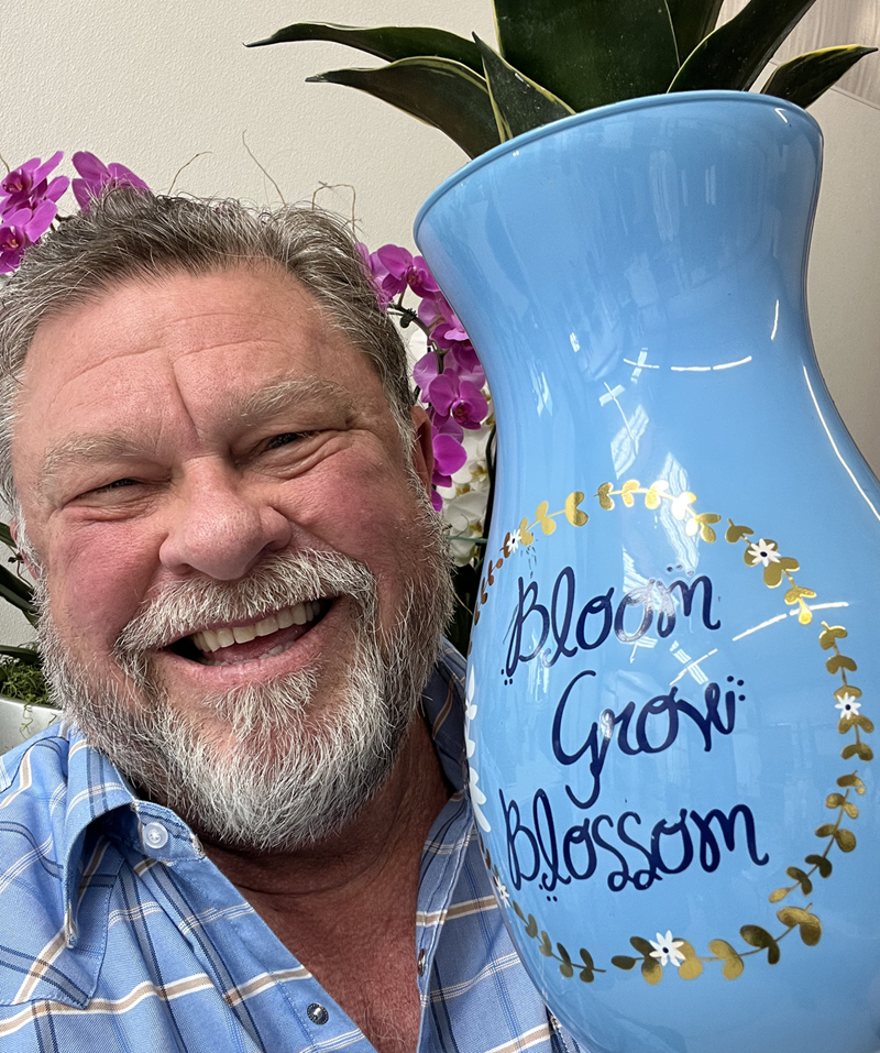
Feeling Very Peri! It’s the 2022 Pantone Color of the Year. Photo: Jim Mumford
At Good Earth Plant Company, we look forward to the annual announcement of the Pantone Color of the Year. It’s true! And we know you do, too. We get a massive response when our review and critique of the annual announcement is posted. Everyone has an opinion about color.
Every color creates different emotions and gives us all the feels: happy, sad, excited, calm, even hungry or relaxed. Our reactions have roots in psychological effects, biological conditioning, and cultural imprinting.
Color is also tied to memory. Color helps the brain store and process images more efficiently than black or white. We remember colorful images better. This is critical when you are in business, an artist, or trying to get someone’s attention. I use color to code different items for faster recall at a glance.
We think about color a lot in our biophilic design work. Multiple shades of green, beige, and brown dominate our designs because we work with plants and other natural elements. But there is plenty of creative potential when we match plants to containers. Moss wall materials come in unlimited colors.
Very Peri: The perfect hybrid?
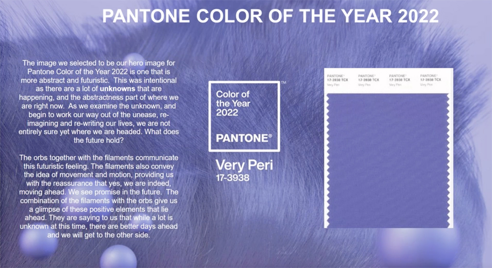
The big reveal: Very Peri is the first custom Color of the Year created by Pantone. Graphic: Courtesy Pantone
Last year, Pantone gave us two colors to represent the pandemic year: Ultimate Gray, a color Pantone describes as “a firm foundation,” and “Illuminating,” a “bright and cheerful yellow.” Together, they were “a story of color that encapsulates deeper feelings of thoughtfulness with the promise of something sunny and friendly.” These were the first yellow and the first gray to be selected as Color of the Year.
This year, Pantone gave us another first. It created its own custom color called “Very Peri” as the 2022 Pantone Color of the Year. Lori Pressman, Vice President of the Pantone Color Institute, calls it a “symbol of the global zeitgeist” and the transition we’re going through.
Very Peri is a warm periwinkle, a bold lavender on the warm side of the spectrum. All colors in the purple family are a blend of cool (blue) and warm (red). They are… wait for it… a hybrid!
Very Peri is a warm-toned lavender, a hybrid of blue with red. Perhaps in the pandemic hybrid year. Graphic: Courtesy Pantone
Hybrid is top of mind for lots of us as we grind our way through pandemic life. We’ve learned to combine our work and home worlds. We’re talking more than ever about healthy work-life balance in “hybrid” workplaces – bringing the best residential design concepts to commercial design. We’ve written about this “resimercial” movement before, and we’ve discussed many of these issues for years.
According to Pantone, Very Peri “helps us to embrace this altered landscape of possibilities, opening us up to a new vision as we rewrite our lives.” We pay a lot of attention to design trends for our clients. Count us in on Very Peri as the perfect representative of all these essential concepts.
Pantone’s Lori Pressman says Very Peri “serves as an expression of the mood and attitude of consumers. We are living in an unusually challenging time that continues to press us forward.” Veri Peri is neither red nor blue. These are the two colors that describe the polarized political viewpoints in our country. Very Peri brings them together. Wouldn’t it be wonderful if people could agree to blend their views just as seamlessly?
Nature’s inspiration
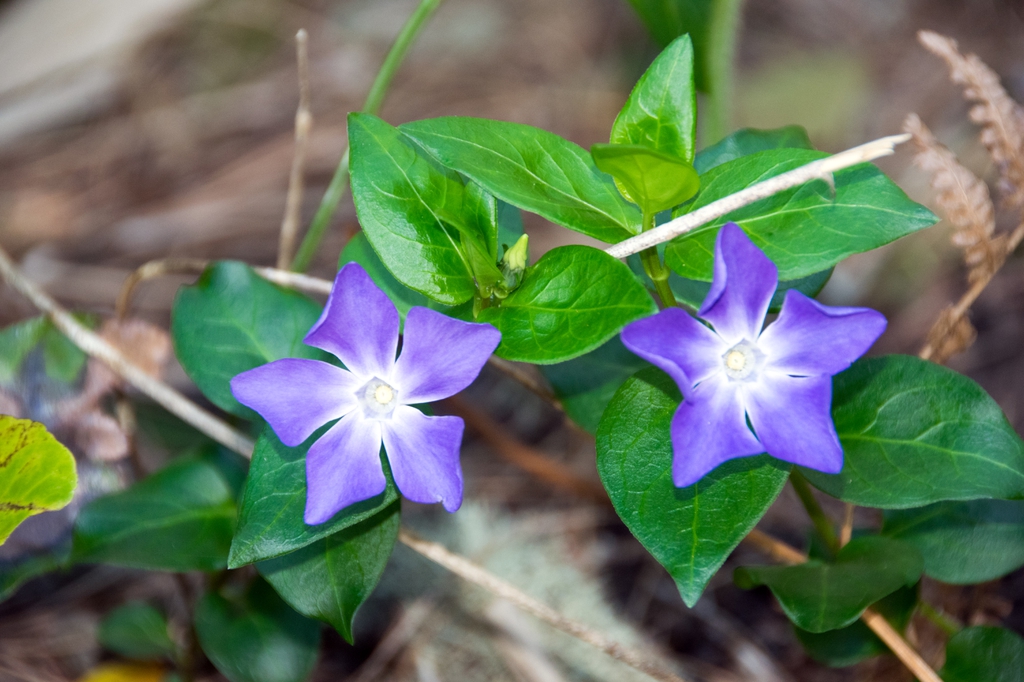
Periwinkle is the common name for a flowering ground cover, Vinca major. Photo: UNC Dept. of Agriculture
Pantone often compares their choices to elements in nature. Nature is where color begins, after all. This year, it’s obvious. The color is named after the periwinkle flower. Before being used to describe a color, periwinkle symbolized the Virgin Mary. It was exactly 100 years ago in 1922 when people began associating periwinkle with the color spectrum. For a century, periwinkle has been an exceedingly popular color.
Periwinkle is a cheerful color. It’s a bit more feminine than masculine. You won’t see it used for a sports car or a pro sports team uniform. But I’ve seen a lot of men’s ties in this color, and it’s growing in popularity as an interior paint color. You can buy a pair of classic Converse high-tops in Very Peri. No, we don’t make any money selling shoes.
Periwinkle symbolizes the beauty of friendship and the power of a strong bond. Using periwinkle is supposed to strengthen connections between people and between design elements. It plays well with either warm or cool colors.
The periwinkle flower is also known as Vinca minor. It is a tough, low-maintenance, flowering ground cover that resists most pests. It has pretty flowers and foliage. Periwinkle vines bloom in spring and summer. It’s hardy and will tolerate being planted nearly any time it’s not freezing overnight. Wait a few more weeks, and you can plant it in San Diego. It tolerates almost any type of soil and nearly any sun exposure. It’s an excellent choice for slopes and erosion control.
Periwinkle is resilient – and isn’t resilience turning out to be one of the most valuable skills we have right now to get through these crazy times? Periwinkle symbolizes setting goals, being tenacious, and working around obstacles. Stumbling blocks are just opportunities to grow.
WARNING: periwinkle is toxic to pets, so keep it out of areas where they have access.
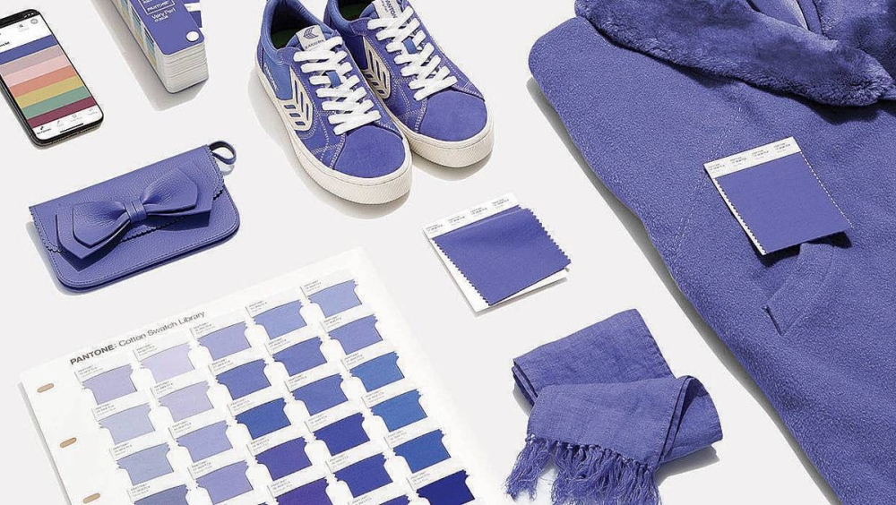
The Very Peri color palette
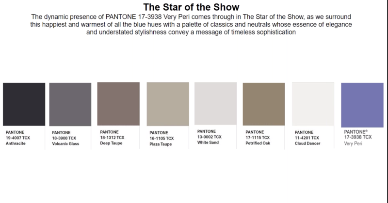
Pantone’s “Very Peri” plays well with so many of the earth toned colors we work with at Good Earth Plant Company. Graphic: Courtesy Pantone
We haven’t used a lot of periwinkle in our Plantscaping or moss wall designs – YET! It’s exciting to think about new options to get our creativity flowing.
We expect to see a dose of Very Peri later this month at the Tropical Plants International Expo in Florida. We missed it last year due to being cancelled because of covid! Let’s hope the supply chain comes through.
Good Earth Plant Company stays ahead of color trends to provide our clients with up-to-date plant styling ideas. Color choices instantly communicate a lot about your business and your home. We can all tell when someone hasn’t updated their interior design for several years.
Good Earth Plant Company never stops working hard to help our clients adjust to the post-pandemic world, and we can make you feel Very Peri, or uplift your environment with all the colors Nature has to offer. We enrich peoples’ lives with plants – and in 2022, maybe a soothing purple. We’re a call away at 858-576-9300.
